Spending at $1 Trillion Dollar Below Projections
It would be hard to find a time in the last half century when the economic picture looked so bright. The economy grew a solid 3.1%over the last year, a period for which most forecasters predicted a recession. Unemployment has been below 4.0% for 23 consecutive months, the longest stretch since the late 1960s.
Real wages are now rising at a healthy pace with the largest gains going to those at the bottom of the wage distribution. As a result of the tight labor market, workers’ job satisfaction is at a record high. Productivity growth looks like it may be on a higher path. Inflation looks like it has fallen back to the Fed’s 2% target. And, thanks to the Inflation Reduction Act, we are finally taking some big steps to slow global warming.
we are saving more than $1 trillion a year on healthcare costs. That comes to $3,200 per person in annual savings or $12,800 for a family of four. That is big money.
This is all really good news that would likely impress most people if they could find out about it, but there is even more. Healthcare costs have stopped rising as a share of GDP and have even declined some in recent years.
Deficit Hawks
If that doesn’t sound like a big deal to you, then you didn’t live through the Golden Age of Deficit Hawks. Back in the 1990s and through the next decade, the very serious people of both political parties insisted that the deficit and debt were exploding and that they would bankrupt the country if we didn’t do things like cut Social Security and Medicare very soon.
While it was not generally appreciated at the time, most of their projections for fiscal doom were based on projections for exploding healthcare costs. This projected explosion of health care costs was based on exploding private sector healthcare costs. This implied huge budget deficits, since the government pays for close to half of all healthcare through programs like Medicare and Medicaid.
If you want to get a taste for these times, read that deficit hawk classic, Will America Grow Up Before It Grows Old: How the Coming Social Security Crisis Threatens You, Your Family, and Your Country, by private equity billionaire Peter Peterson.
Healthcare Cost Explosion Didn’t Happen
The deficit hawks have not gone away, but the healthcare cost explosion, which was the basis for their warnings 30 years ago, never came. Healthcare spending as a share of GDP rose from 11.4% in 1990 to 13.6% of GDP at the end of 1999.[1] It then rose further to 17.3% of GDP by 2010.
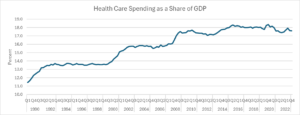
Source: National Income and Product Accounts and Author’s Calculations, see note at end of article.
Since 2010 healthcare spending has changed little as a share of GDP. At 17.6% of GDP in 2023 its below the pre-pandemic peak of 18.3% in 2016.
The year 2010 is notable because that was the year that Obamacare was passed into law. It would be wrong to claim that Obamacare was the sole reason for the slowing of healthcare cost growth. Costs slowed in most other wealthy countries, too. But Obamacare contributed to the slowing here.
Also, as a political matter, no one can doubt for a second that if costs had gone the other way, that the Democrats would be held fully responsible for rising healthcare costs. That would be the case even if every other wealthy had a larger increase, a story that we just saw with the pandemic inflation.
Big Money
Seeing fractions of GDP may hide the amount of money involved in these healthcare cost savings. If we were spending 18.3% of GDP on healthcare, as we did in 2016, instead of the current 17.6%, that would amount to another $196 billion going to healthcare spending this year. That’s good news because we aren’t spending an extra $600 per person or $2,400 for a family of four.
The savings are even larger compared to a scenario where health care costs had continued to grow at their pre-2010 pace. Healthcare spending as a share of GDP rose by 5.9 percentage points between 1990 and 2010. Had it continued to grow at this pace, healthcare spending would have been 21.4% of GDP in 2023, 3.8 percentage points above its current level.
Compared to that benchmark we are saving more than $1 trillion a year on healthcare costs. That comes to $3,200 per person in annual savings or $12,800 for a family of four. That is big money.
Hey, Where Are My Savings?
People seeing these calculations can reasonably be complaining that they didn’t see any savings on healthcare. And, in fact they didn’t. These are savings measured against projected cost growth. It turns out that the projections were wrong, whether that was due to good policy or bad projections is not easy to say.
In any case, it’s understandable that people wouldn’t get too excited about savings compared to projections that they know nothing about. It is worth saying here that, at the time, these projections were taken very seriously by people in policy debates across the political spectrum.
If someone debating budget policy in 2010 had substituted the actual course of health care cost growth for the next 13 years, the data we now know, they would have been laughed off the stage for ignoring the widely projections being used at the time.
We are hugely better off than if the experts had been right in 2010 about the future course of healthcare cost growth.
There are two other important points to be made about these healthcare spending numbers. First, most of us don’t directly pay for most of our healthcare. Most of us have insurance, either through our employer or the government
While what our employer pays for insurance is reflected to some extent in our cash pay, and government payments show up in overall spending, we don’t directly see the healthcare costs we incur. This means that if our employer ends up paying less for health insurance, we may never directly experience these savings, even if some of the savings eventually shows up in our paychecks. Of course if it just adds tio profits then we wouldn’t enjoy any of the savings.
The other point is a bit tricky. At the end of the day, we don’t really care about buying health care services, we care about our health. No one is happy about having more doctor visits or medical tests. People are happy about being in good health. Most people would be very happy if they could have good health with less medical care.
The question that has to be asked in the context of these savings is whether the quality of care and public health has deteriorated since 2010.
There is evidence that since 2010 public health has worsened by some important measures, like life expectancy. Anne Case and Angus Deaton documented the rise of “deaths of despair” in the deindustrialized Midwest. However, this rise predates Obamacare. The deterioration in health for a substantial segment of the population can’t in any obvious way be attributed to the Affordable Care Act (ACA).
It is common for people to complain about wait times to see doctors and bureaucratic hoops insurers put patients through to see specialists. These are bad features of our healthcare system. These are also problems existed long before Obamacare.
Finally, it is worth noting that even with the slower increases in healthcare cost growth since the ACA was passed, we are still paying almost twice as much per person for our healthcare as other wealthy nations. And, we have little to show for this extra spending in terms of better outcomes. In short, there is still plenty to complain about with our healthcare system.ƒ$12,
Nonetheless, we should be happy for the good news – the projected healthcare cost explosion never came. And, with a bit of luck our healthcare costs may actually come down a bit more. Some efforts by the Biden administration, such as reducing drug prices and restraining monopoly power for large insurers , pharmaceutical companies, and other big actors in the healthcare industry, may prove helpful in this respect, but we have a very long way to go to get our costs in line with other wealthy countries.
[1] These numbers are slightly higher than what the Centers for Medicare and Medicare Services (CMS) report for healthcare spending as a share of GDP in 2022, the latest year for which full data is available. CMS showed 17.3% while my calculations come to 17.5%.
I assume this is due to some double counting, where I may have some government healthcare spending, which also shows up as consumption. I added lines 64, 119, 170, and 273 from NIPA Table 2.4.5U and line 32 from NIPA Table 3.12U. These are therapeutic equipment, pharmaceuticals and other medical products, healthcare services, and net health care insurance.
Line 32 is the government spending on Medicaid and other healthcare provision. Although the level is somewhat higher than the CMS data indicate presumably the changes over this period follow the changes as measured by CMS reasonably closely.